Careerplanb · August 13, 2026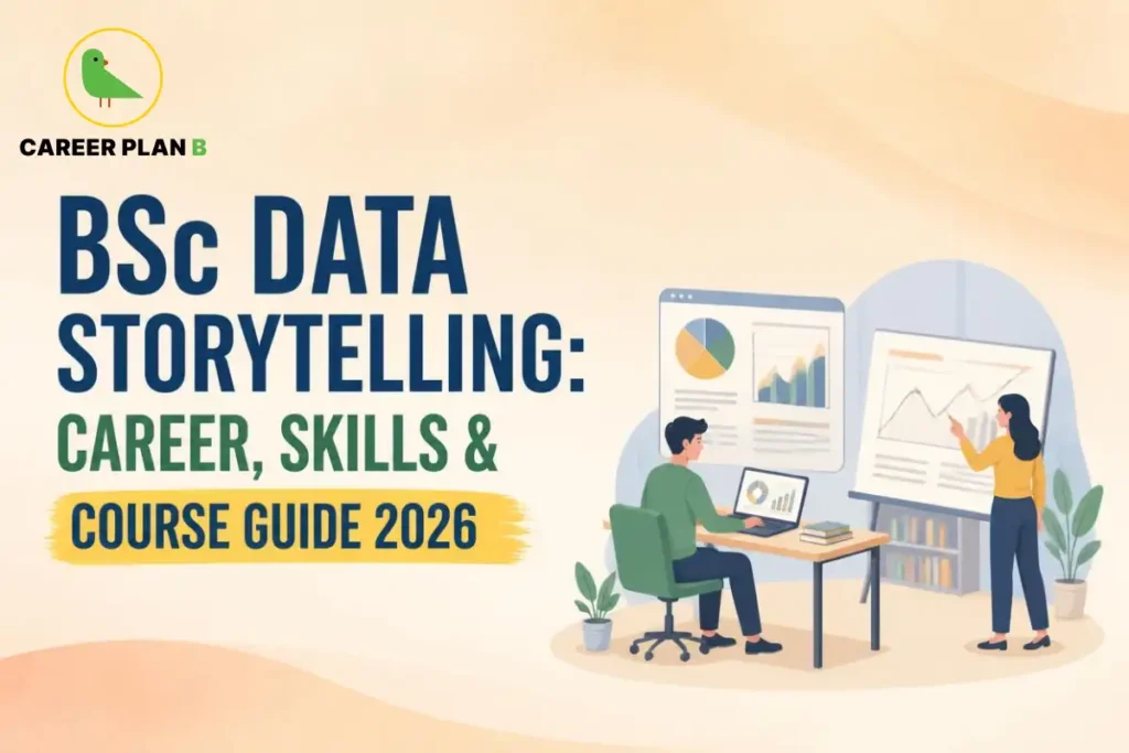
Introduction
An analyst spends three weeks building a model that perfectly explains a sales crash. She presents it in one slide, packed with numbers, to a room of executives who tune out within ninety seconds. The math was flawless. Nobody remembers it. That exact, painfully common failure is precisely what a Data Storytelling Course is built to prevent.
One honest heads-up before we start: no Indian university offers a standalone “BSc in Data Storytelling,” this is a skill layered onto a data degree, not a degree on its own. This guide breaks down what a genuine Data Storytelling Course actually teaches, and why it’s quietly becoming the difference between an analyst who gets heard and one who doesn’t.
What Does Data Storytelling Actually Mean?
Data storytelling is genuinely the art of using narratives and visualisations to effectively convey insights from a dataset. Consequently, it combines visuals, insights, and context to guide the audience through the analysis, rather than simply dumping charts and numbers onto a slide.
Furthermore, this skill matters because a good story can turn data into action, whether you are presenting to executives, clients, or stakeholders. Therefore, this is not decorative polish, it is genuinely the difference between an insight that gets acted on and one that gets ignored entirely.
Is This the Same Thing as Data Visualization?
Related, but not identical. Data visualisation focuses specifically on turning numbers into charts and dashboards, while data storytelling goes further, weaving those visuals into a persuasive, tailored narrative for a specific audience. Therefore, visualisation is one tool within the broader storytelling skill set, not a complete substitute for it.
For Personalized Guidance
Data Visualization Course: What Tools Should You Actually Learn?
Strong programmes in this space build fluency across several genuinely essential tools, not just one platform in isolation. Here is a breakdown of what quality courses typically cover.
| Tool | What It’s Used For | Learning Curve |
|---|---|---|
| Tableau | Creating interactive dashboards and performing advanced data visualisation and analytics | Moderate; widely taught in data analytics and business intelligence programmes |
| Power BI | Building business dashboards and reports integrated with the Microsoft ecosystem | Beginner-friendly; commonly used in corporate and business environments |
| Excel / Google Data Studio | Creating basic charts, graphs, dashboards, and quick data summaries | Easy; an ideal starting point for beginners learning data visualisation |
| Python (Matplotlib, Seaborn) | Developing customised, code-based visualisations for complex datasets and analysis | Advanced; best learned after building a foundation in Python programming |
Notably, Microsoft Learn provides a genuinely practical, free route specifically for people who want to specialise in data visualisation and reporting, covering Power BI, data modelling, and storytelling using dashboards together. Therefore, strong, credible options exist even without significant upfront cost.
Where Does This Skill Actually Fit Within a Larger Degree?
Data storytelling and visualisation modules typically appear inside broader BSc or BTech programmes in Data Science, Computer Science, or Statistics, rather than existing as a separate standalone degree. Therefore, if you want a formal degree foundation, look specifically for programmes that dedicate genuine coursework to visualisation and communication, not just modelling and coding alone.
Career in Data Storytelling: What Roles Actually Value This Skill?
This is genuinely a cross-cutting skill rather than a single job title. Depending on your broader specialisation, this ability strengthens several distinct roles.
- Data Analyst – translating raw datasets into clear, decision-ready reports for stakeholders
- Business Intelligence Developer – building dashboards that communicate trends at a glance
- Data Journalist – turning public datasets into compelling, visual news stories
- Product or Marketing Analyst – presenting user and campaign data persuasively to non-technical teams
- Management Consultant – using data narratives to support strategic client recommendations
Why Do Employers Specifically Value This Combination?
As the world becomes more data-driven, the ability to analyse and visualise data is no longer a luxury, it is genuinely a necessity, expected across industries to make informed decisions, solve problems, and drive business growth. Consequently, candidates who pair technical analysis with genuine communication skill consistently stand out from those who can only build models.
What Does a Genuinely Strong Data Storytelling Course Actually Cover?
Beyond tool proficiency, strong programmes build several distinct, non-technical skills that genuinely separate good data communicators from great ones.
- Audience Tailoring – adjusting technical depth and framing based on who is actually receiving the insight
- Narrative Structure – building a clear beginning, tension, and resolution around the data’s key finding
- Data Ethics and Integrity – presenting insights honestly without misleading through selective visualisation
- Persuasive Communication – using visuals and framing specifically to drive stakeholder action
Notably, courses genuinely worth pursuing explicitly teach data ethics alongside technical skill, ensuring visualisations inform decisions honestly rather than manipulating perception. Therefore, this ethical grounding is genuinely part of what separates a credible course from a purely tool-focused one.
How Should You Actually Start Building This Skill?
Breaking into data storytelling works best through a structured, layered approach rather than jumping straight to advanced tools.
- Start with basic charts in Excel or Google Data Studio, building comfort with fundamental visual principles first
- Progress to Tableau or Power BI, learning to build interactive, genuinely audience-ready dashboards
- Take a dedicated data storytelling module, from providers like Coursera, specifically covering narrative framing and audience tailoring
- Practice presenting real findings, even from personal projects, to genuinely different audience types
- Pair this skill with a core data foundation, whether through a formal degree or a broader analytics certification
A Word of Caution Before You Commit
Always verify that a course genuinely covers narrative and audience-tailoring skills, not just tool tutorials alone, since the storytelling element is precisely what differentiates this from a basic visualisation course. Additionally, remember that this skill works best layered onto genuine technical foundation, not as a standalone credential by itself.
How Career Plan B Helps
Figuring out where a Data Storytelling Course genuinely fits within your broader academic and career plan takes more than picking a trendy certification.This is where Career Plan B can help by offering:
- Personalised Career Counselling: Provides expert guidance based on individual interests, skills, and career goals, helping you decide which data-focused degree and storytelling certification combination fits best.
- Psychometric & Career Assessment Tests: Identifies strengths, personality traits, and suitable career opportunities, useful for confirming genuine aptitude for both analytical and communication-focused work.
- Career Roadmapping: Creates a clear step-by-step plan to achieve academic and professional goals, including which tools and certifications to prioritise in sequence.
- Admission & Academic Profile Guidance: Helps in selecting the right courses and colleges and improving academic profiles, so your data science foundation genuinely supports this specialisation.
Get In Touch With Us
Frequently Asked Questions
1. Is there a standalone BSc in Data Storytelling?
No, this specific skill set is typically taught as modules within broader BSc or BTech programmes in Data Science, Statistics, or Computer Science, rather than as its own separate degree.
2. What is the difference between data storytelling and data visualization?
Data visualisation focuses on turning numbers into charts and dashboards, while data storytelling weaves those visuals into a persuasive, audience-tailored narrative.
3. Which tools should I learn first for data storytelling?
Start with Excel or Google Data Studio for fundamentals, then progress to Tableau or Power BI for interactive, professional-grade dashboards.
4. Do I need a coding background to learn data storytelling?
Not necessarily at the start. Tools like Power BI and Tableau are genuinely beginner-friendly, though Python-based visualisation eventually helps for more complex, custom work.
5. Which careers actually value this specific skill combination?
Data analysts, business intelligence developers, data journalists, product analysts, and management consultants all genuinely benefit from strong data storytelling ability.
Conclusion
Data storytelling has genuinely become one of the most undervalued, high-impact skills in the data field, the difference between an insight that sits ignored in a report and one that actually changes a business decision. While no standalone BSc exists for this specific skill, layering strong visualisation and narrative training onto a solid data science foundation genuinely sets candidates apart in 2026’s job market.
If you are still figuring out how to build this specific combination of skills into your academic plan, thoughtful guidance can bring real clarity. The best data professionals are not just the ones who find the insight, they are the ones who make sure it gets heard. Talk to a Career Plan B counsellor today to plan the right data-focused career path for you.